Project Overview
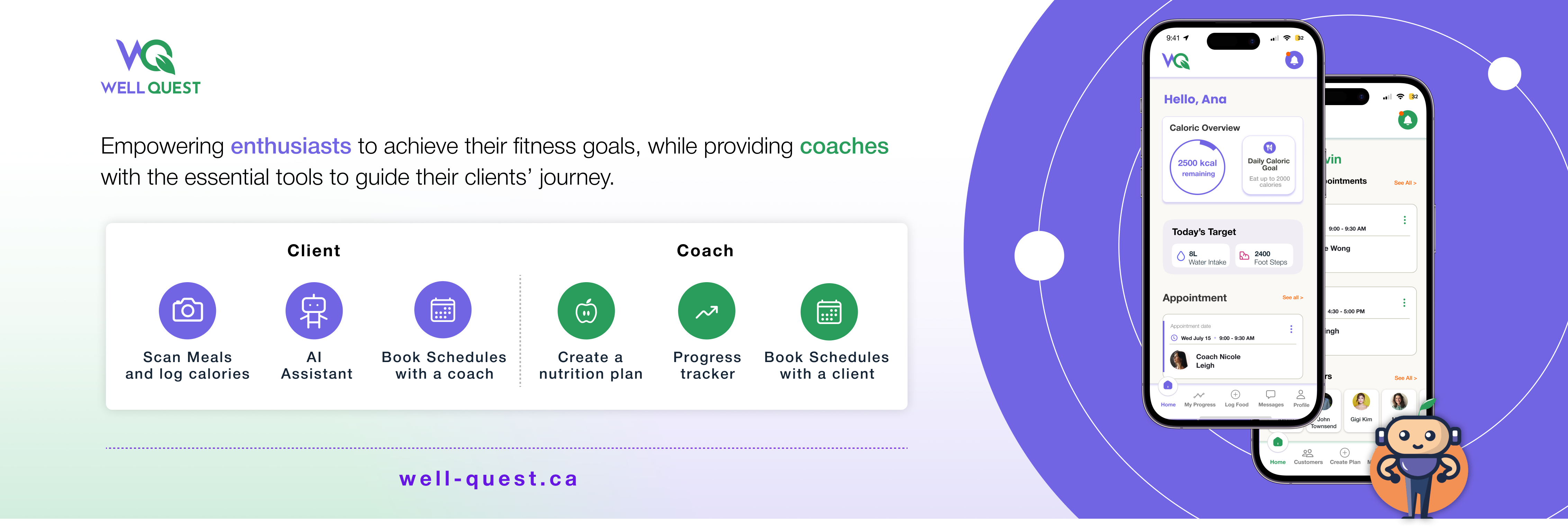
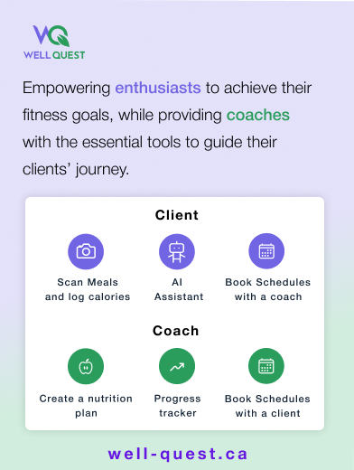
Well Quest is an app that empowers fitness businesses and trainers to support customers in achieving their nutrition goals by providing visibility and tracking into their nutritional activity.
The Opportunity
Fitness enthusiasts encounter difficulties in logging calories and tracking nutrition, which leads to time-consuming tasks and a lack of personalization. On the other hand, Manual tracking by gym coaches is prone to errors and lacks real-time insights for timely adjustments to training programs.
My Roles and Responsibilities
Leading the Design area, Conducting User Experience Research, Designing the low-medium fidelity wireframes, Mock-ups, Ui Kit, Logo, and testing the product with Usability Study.
Design Thinking Process
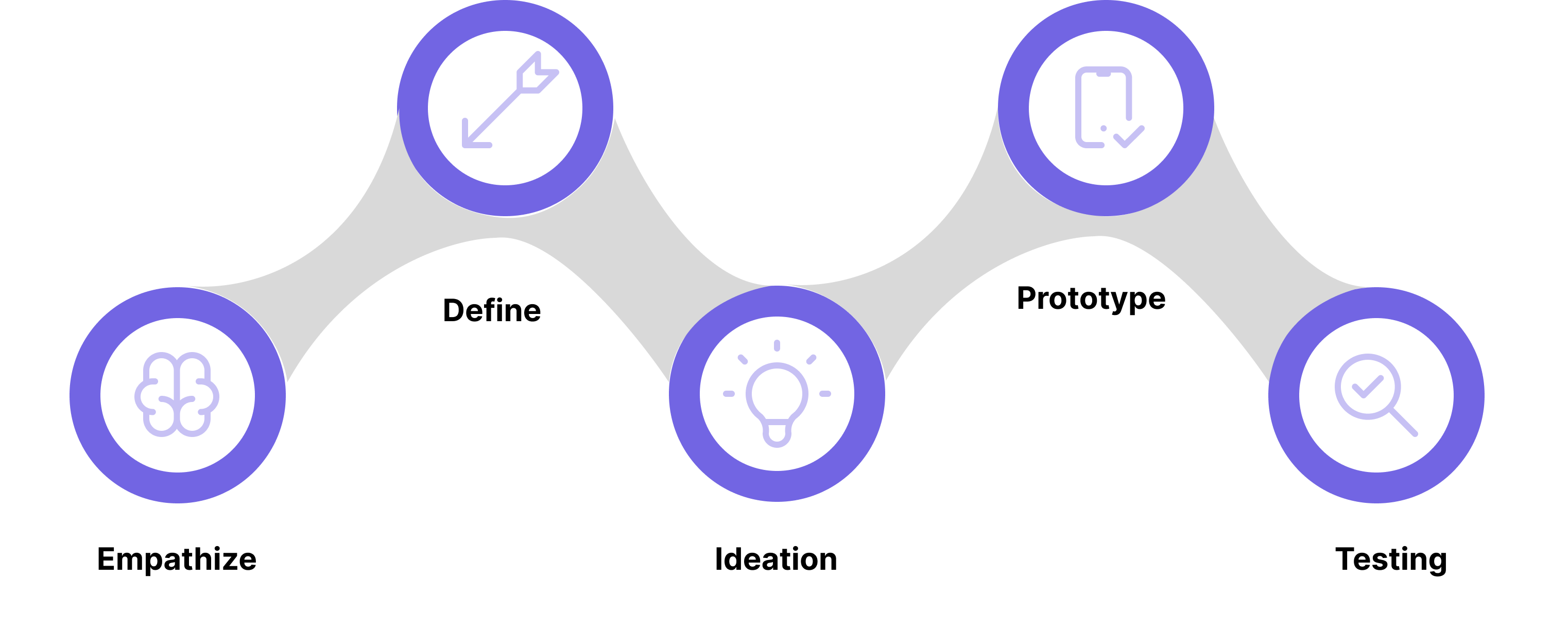
I started the project with user centered approach, addressing the whole user experience. Interactive design thinking process consists of five phases: Empathize, define, ideate, prototyping and testing. Furthermore, during the testing stage, we implemented the A/B testing method to reach the most assertive approach for the user. By following this method we can easily be able to solve the problem of the user.
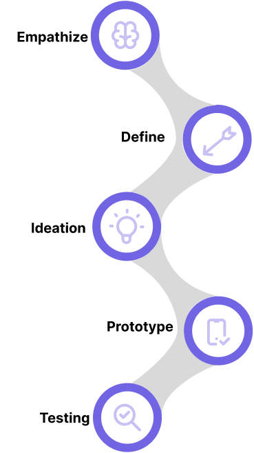
- User Interview
- Online Survey
- Competitors Analysis
- User Persona
- User Journey Map
- User Story
- Problem Statement
- User Flow
- Low Fidelity Wireframes
- Mid Fidelity Wireframes
- Mockups
- Usability Test
User Flow
User flow is the sequence of steps that a user takes to achieve a goal in a product, such as a website or an app. After setting the idea and interviewing the possible users, we made a user flow to map out the features and the flow for both users: The client and the Coach. In the following diagram, the purple color represents the client and the green color represents the coach.
Wireframes
Once we had the user flow completed, we designed Mid Fidelity wireframes to define the layout, functionality, content, and see clearly the flow.
Mockups
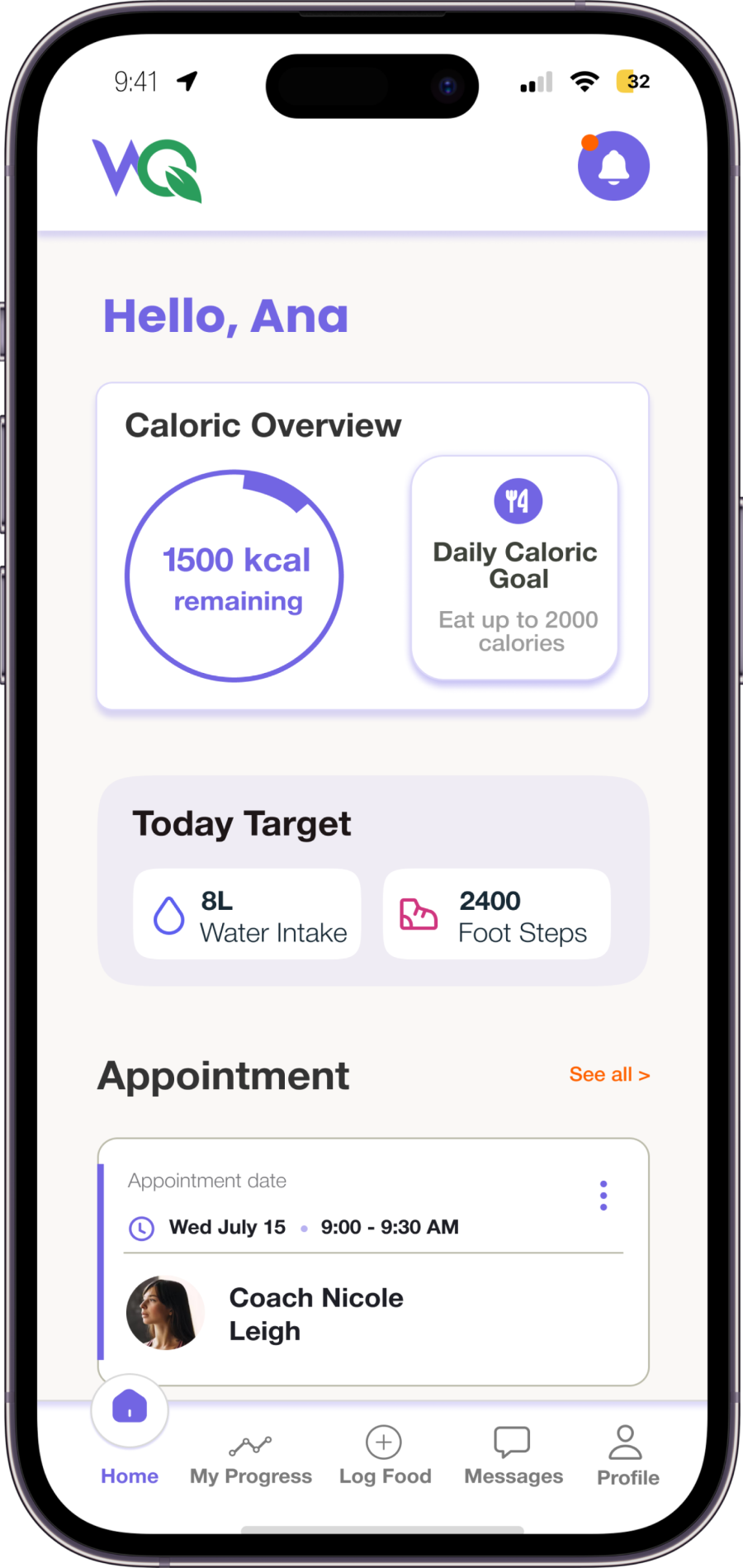
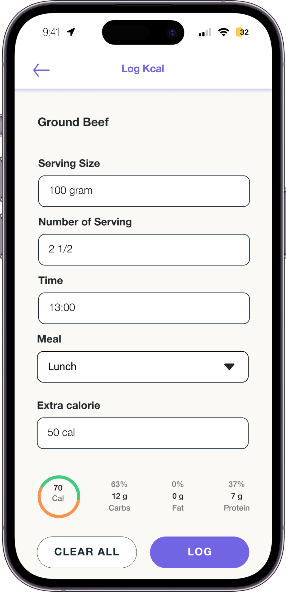
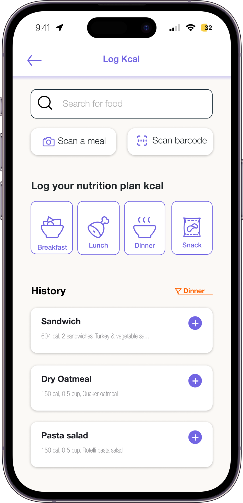
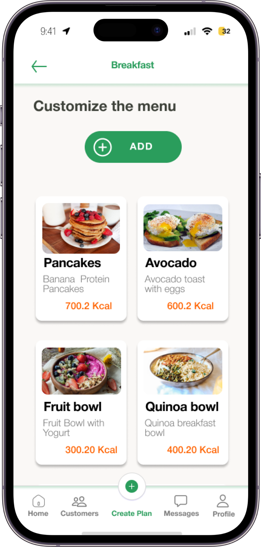
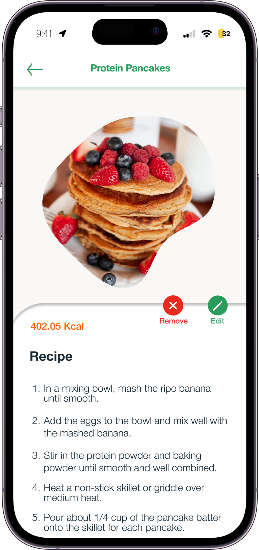
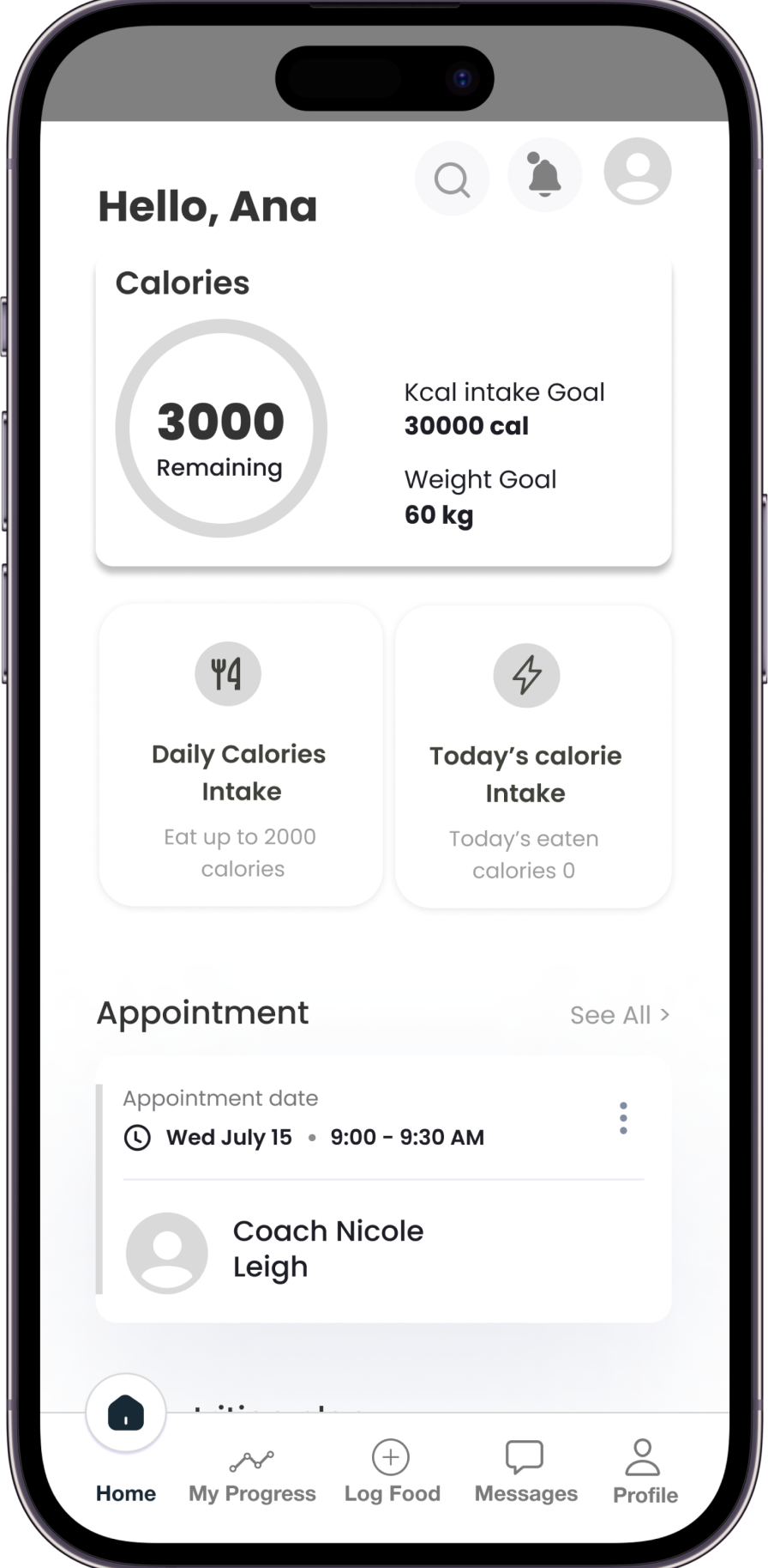
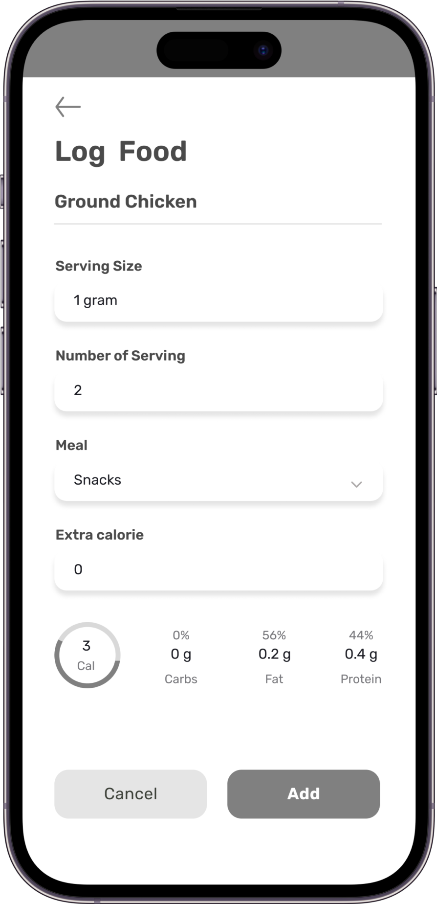
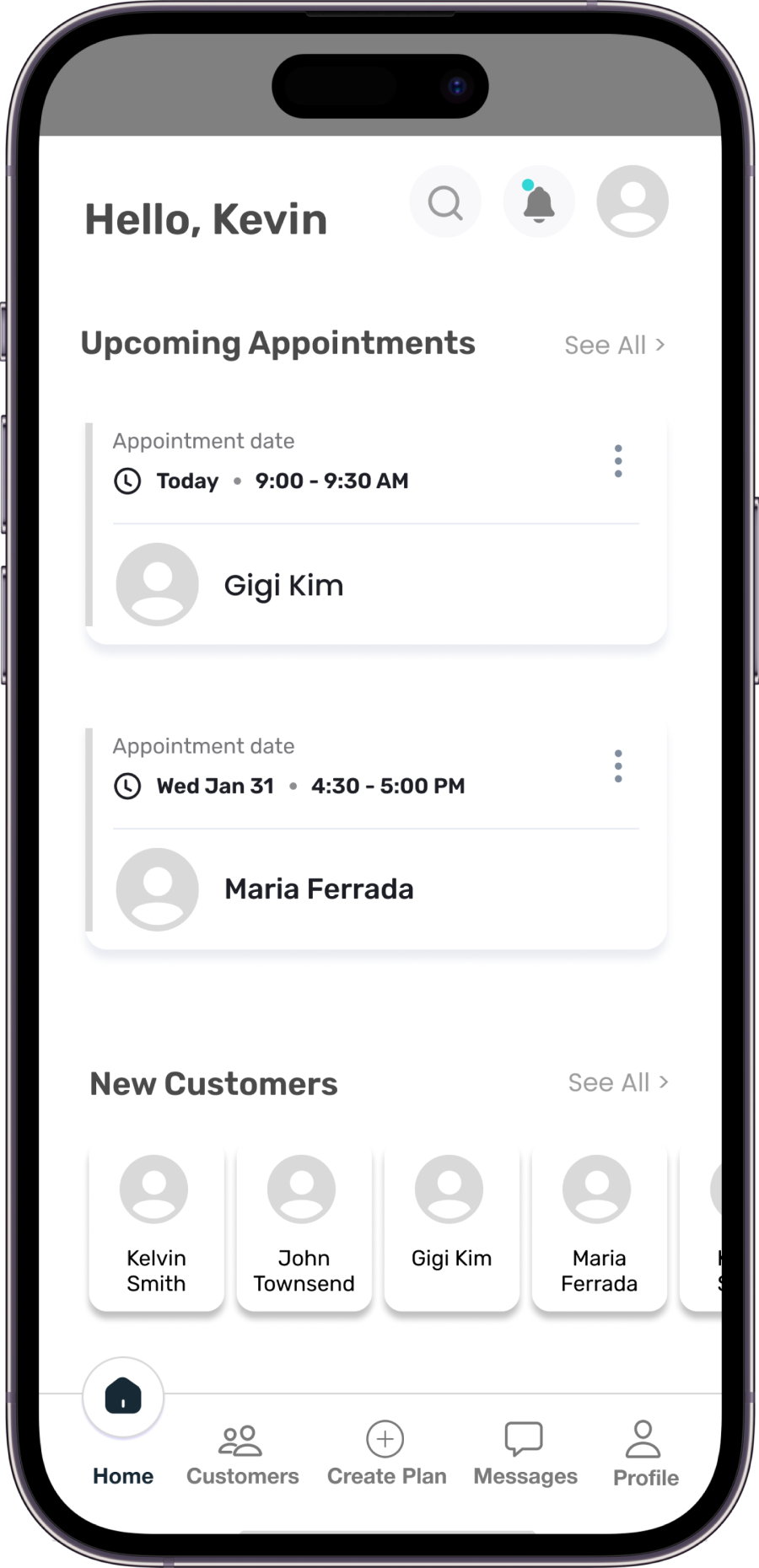
Mock-ups serve as visual representations of the interface, including layout, functionality, content, colors, and typography. They represent the final version of the product. We've applied our minimalist branding and visual style to ensure easy navigation for users. It's important to note that colors were carefully selected: purple serves as the primary color for the customer side as it represents power, while clover green is primary for the coach side as it represents professionalism and wellness. Both utilize blaze orange as an accent color to highlight links, radio buttons, and carousels.
