Project Overview
Wisecare is a web platform that connects seniors in need of services with volunteers who can assist them with their daily tasks so they can keep preserving a good life quality.
The Opportunity
Seniors live alone or far to their relatives and need continuous support causing them to feel alone and to isolate themselves. On the other hand, youth have free time and get so addicted to social media or videogames.
My Roles and Responsibilities
Conducting User experience research, low-medium fidelity wireframe, Mock-ups design and testing with usability study.
Design Thinking Process
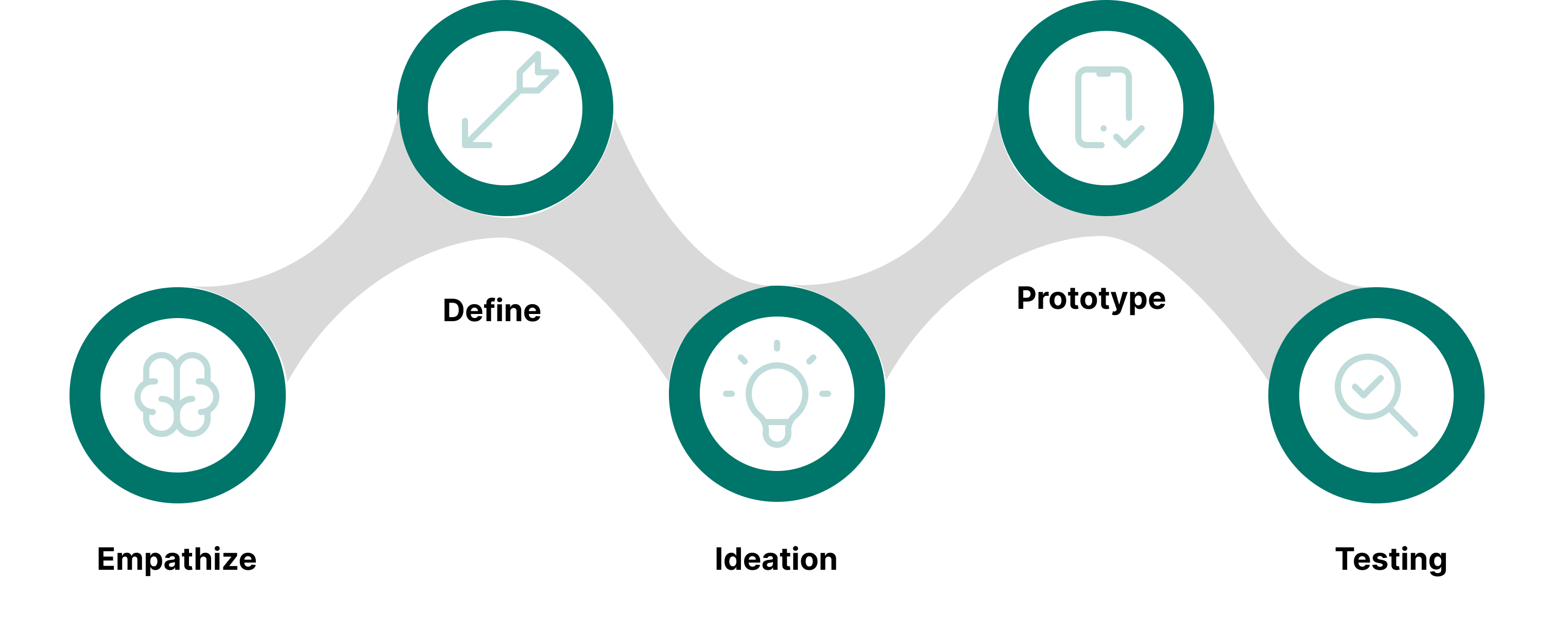
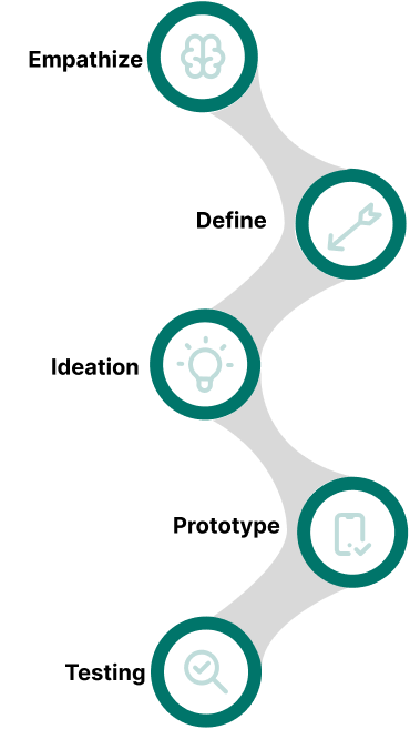
I started the project with user centered approach, addressing the whole user experience. Interactive design thinking process consists of five phases: Empathize, define, ideate, prototyping and testing. By following this method we can easily be able to solve the problem of the user.
- User Interview
- Online Survey
- Competitors Analysis
- User Persona
- User Journey Map
- User Story
- Problem Statement
- User Flow
- Low Fidelity Wireframes
- Mid Fidelity Wireframes
- Mockups
- Usability Test
User Flow
To create Wisecare we passed through a whole process. We started by
doing a research including interviews with seniors, volunteers and
owners of care homes and with these insights we created a user flow to
have an idea of the features of our product and how the users were
going to interact with them.
In the following diagram we divided the flow in 3 main tasks which are
our three main features. The senior flow is highlighted with green
color while the volunteer is highlighted with orange color.
Wireframes
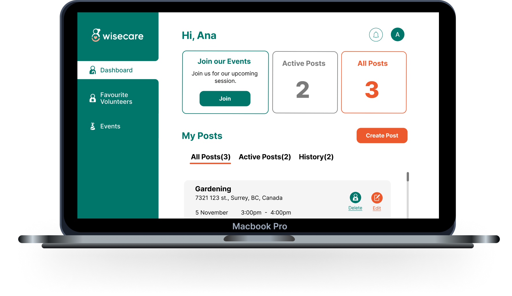
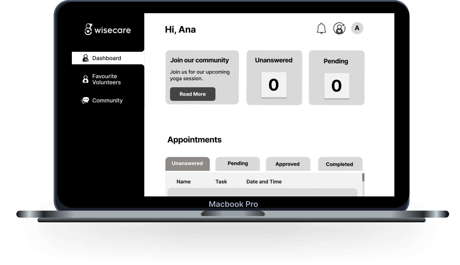
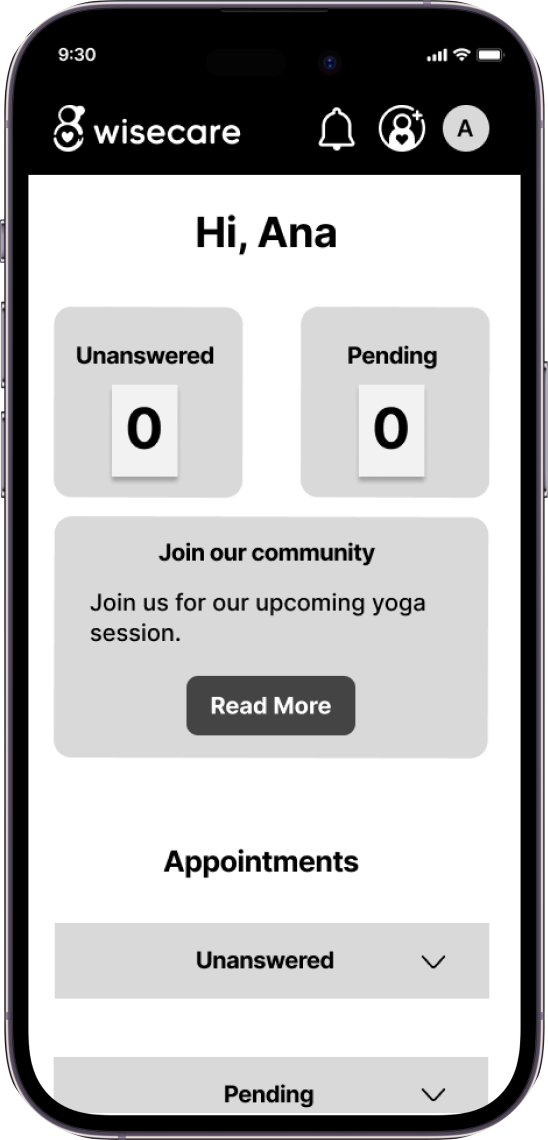
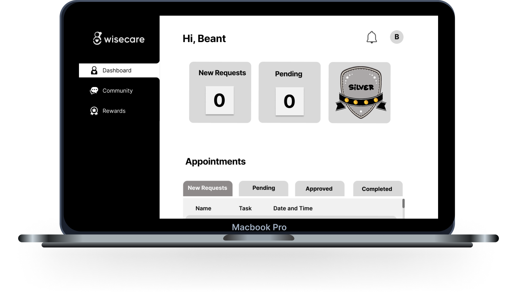
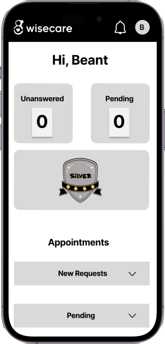
Based on this User flow, we created high fidelity wireframes to visualize layout, sizes, and structure of the web application.
Mockups
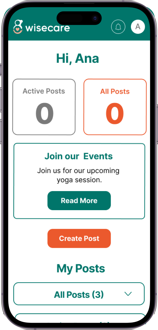
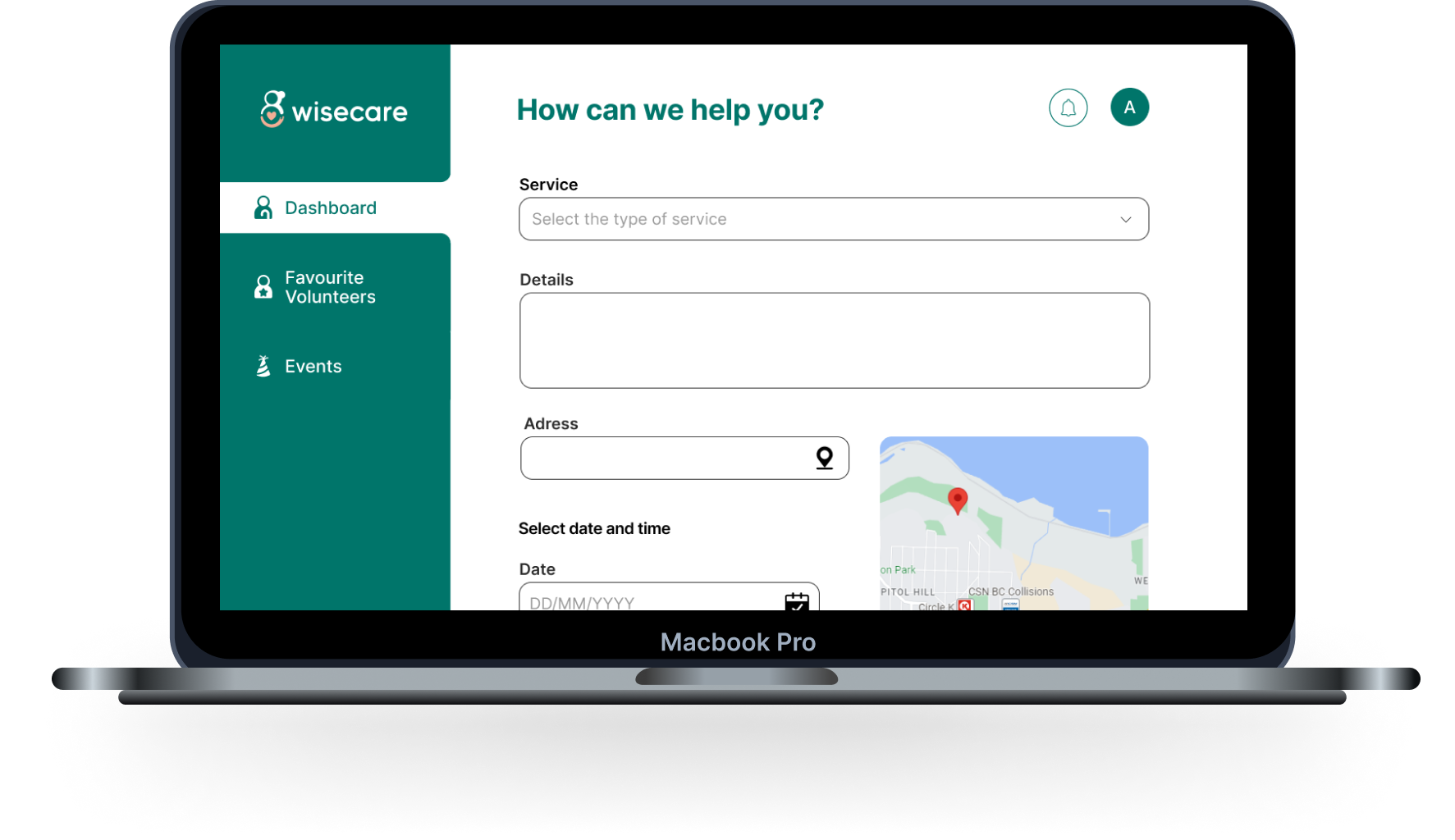
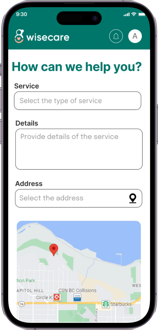
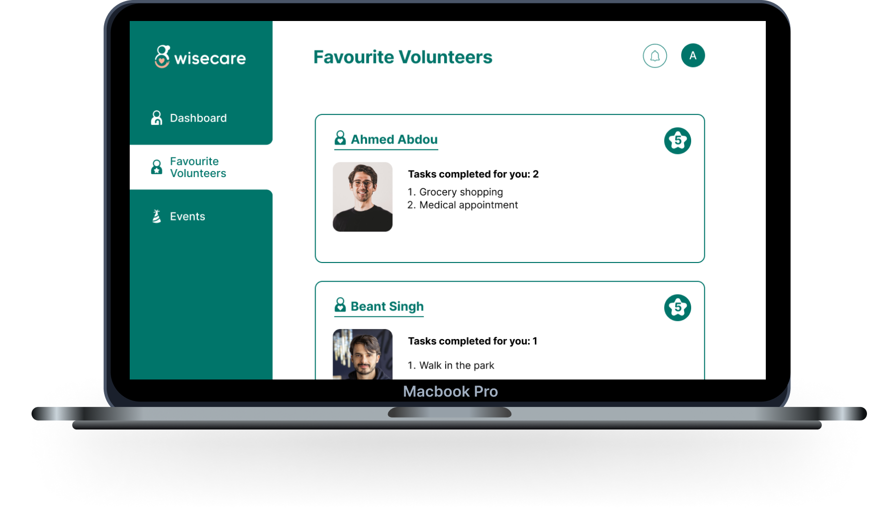
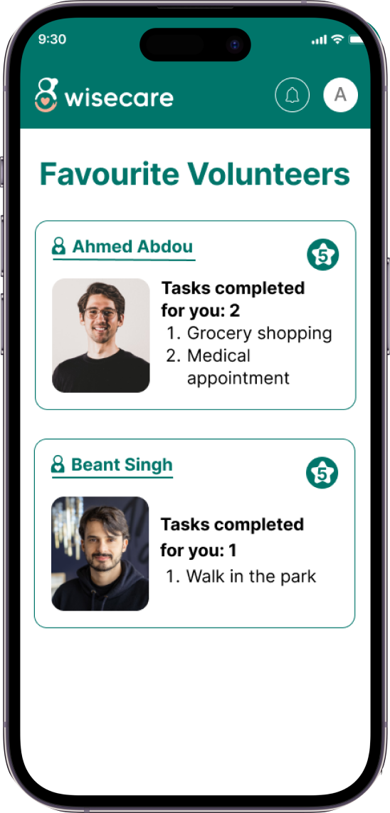
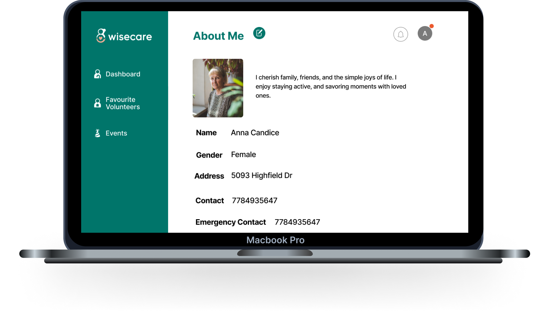
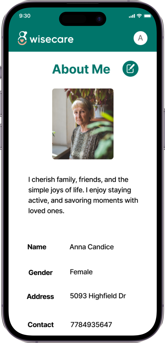
We created High Fidelity Mockups, applying real branding elements. Our brand identity, reflecting the connection between volunteers and seniors, features a logo with a circular shape representing services surrounding seniors, a hand for volunteers, and a heart symbolizing care. Pine green is our primary color for trust, peach for caring, and orange for supportiveness. Made Tommy Soft is our logo's typography, chosen for readability, while Inter is used for the web app due to its accessibility features. Glyph icons were implemented for their simplicity and ease of orientation.
